Your homepage is the gateway to the rest of your website. It gives users the first glimpse of what you have to offer, and creates the first impression of your business. That’s why homepage analysis is a vital part of any heuristic evaluation process.
As we have mentioned in a previous blog post, users will often make up their mind whether to stay or leave in a matter of seconds once they land on your website homepage for the first time. It’s a major risk factor for losing users if they don’t have a clear path on where to go next from the home page. How do they find the information they need? How do they search for the products they want? Is it obvious what they need to do next? If not, you could be losing out on valuable conversions.
The goal is to create a smooth path where users can get into a state of “flow”. Enable them to navigate along various paths to accomplish their goals on your website, without encountering friction or roadblocks.
What do your users want?
When planning how you want customers to move around your website, it’s always best to begin with research. Gain an understanding of them, their needs, desires and motivations. User research will provide a strong foundation of knowledge to anchor the design and navigation.
- Is there a particular problem do your users want to solve?
- What are their needs or desires?
- Why specifically does your service or product matter to your user?
- What will compel them to take action?
The answers to these questions will help you determine how to present information on your website. The goal is to structure the information in such a way that it keeps users moving down the funnel. Finally, they should take the desired action (such as making a purchase).
After gathering user research, you may wish to synthesize the information into user flow diagrams or flow charts.
Mapping the flow
User flows or flow charts are diagrams illustrating the paths a user takes when they are interacting with your product. With this technique, you can plan and visualise how people will move around the website and make sure it flows in a logical, intuitive way.
The flowchart usually begins with the user’s entry point to the product, such as the home page or onboarding screen. It will end with the final outcome, such as making a purchase or creating an account. Each touchpoint will be represented by a shape which is then connected to the next possible actions with arrows. There are usually many different potential pathways a user can take when they’re interacting with a product, so a flowchart will take these into consideration.
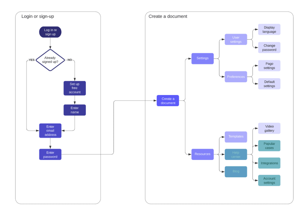
User flow charts are often used early in the UX design process. However, they can also be a useful tool for evaluating products that are already in use. Try going through your website and completing the actions you want your users to take step-by-step, sketching out the journey as you do so. This could help you to uncover any sticking points or areas where users may be getting confused. This type of analysis can also be a valuable addition to your heuristic evaluation process.
Ask some of your users to carry out particular actions and observe what they’re doing. Alternatively, ask them to narrate their thoughts about their user journey. Do they click in the wrong places? Are they confused about what they need to do to sign up or make a purchase? Are they getting stuck at certain points? It could be time to make some UI adjustments to make the actions flow more smoothly.
Where am I?
When a user arrives on a new screen, they want to know exactly where they are and what stage of the process they are at. You can achieve this using many different techniques. For example, there may be a navigation bar which highlights which page the user is on. There may simply be clear headings and titles which tell us where we are and what we can expect to find on this page. Make sure to look for elements like this when you complete your heuristic evaluation.
Navigation
Well-designed website navigation is a must if you want to give your users a good experience, allowing them to flow from page to page without becoming frustrated or confused. When a site has intuitive navigation, users are much more likely to convert, or to leave the website with the intention of returning again in the future.
Creating a hierarchy
This is one of the most important elements to consider when it comes to designing pages that are clear and easy to navigate. In simple terms, visual hierarchy involves organising content on a page from most to least important, with the highest-priority content given the most focus.
The visual hierarchy of the page controls how the user focuses their attention, guiding their eye towards the different elements in appropriate ways.
You can build visual hierarchy using:
- Colour and contrast: bold colours and high contrast will make elements stand out, while more muted colours and lower contrast will make others recede.
- Sizing: as a rule, headings will be larger to make them stand out more.
- Grouping and proximity: grouping elements together in certain ways to show the relationships between them, such as placing related content blocks close together.
- White space: with effective use of space around content or elements, you can draw the eye to them, or away from them.

User control and freedom
This is one of Nielsen’s heuristics, the most well-known guidelines for heuristic evaluation. Users like to have a feeling of control over the UI when they are interacting with it.
Users will sometimes make mistakes, need to undo something, or want to backtrack to a previous touchpoint. For a good user experience, you’ll need to provide them with a clear exit. Allow them to recover from errors or leave the unwanted state without the need for long or complicated dialogues. Features such as clearly-marked navigation bars and undo/redo functions are invaluable. They give users the confidence that they can easily get out of their current state if they need to.
When users feel that they can quickly correct their mistakes or undo their choices, they’re more likely to explore. This gives them more opportunity to discover other features and information. It also increases the likelihood of brand loyalty, and increases user satisfaction.
Check that your users can move around your website freely
The ease with which users can move around your website will make a huge impact on its success. With a well-signposted and well-designed user flow and navigation options, you can provide a higher quality user experience. By guiding your user towards their goal, you can greatly increase your conversion rate and reach your business targets.
Navigation and ease of user flow are crucial for good UX. This is one of many areas you will investigate when you carry out a heuristic evaluation with Heurix. Sign up today and gain access to a comprehensive set of heuristics. Heurix will help guide your website design process and uncover any existing usability issues you may have.