Create the right first impression with a simple Heurix UX audit
Are you finding that users are leaving your site too quickly? Are your conversion numbers lower than you were hoping for? It could be down to the first impression you’re projecting. When you carry out your UX audit with Heurix, you will be guided through questions to help you identify whether your website is making a good first impression.
Visual first impressions can mean the difference between a user staying on your website and converting into a paying customer, or losing them as a prospect forever.
First impressions are almost instantaneous
We’ve all done it: clicked onto a website, saw a page that didn’t appeal to us, then immediately clicked “back” to exit. In these instances, we didn’t have enough time to read the information or explore the site to see if it had something to offer us. So why did we make the decision to leave so quickly?
Google studies have shown that it takes users just a fraction of a second to form an opinion of a web page – as short as 50 milliseconds. The decision to stay or go is often based on the gut feeling the user experiences at first glance.
If you want to capture a user’s attention and get them to stay on your site, you have an extremely short window of time to do so. This is why it’s so important to optimise for first impressions.
How can you make a good first impression?
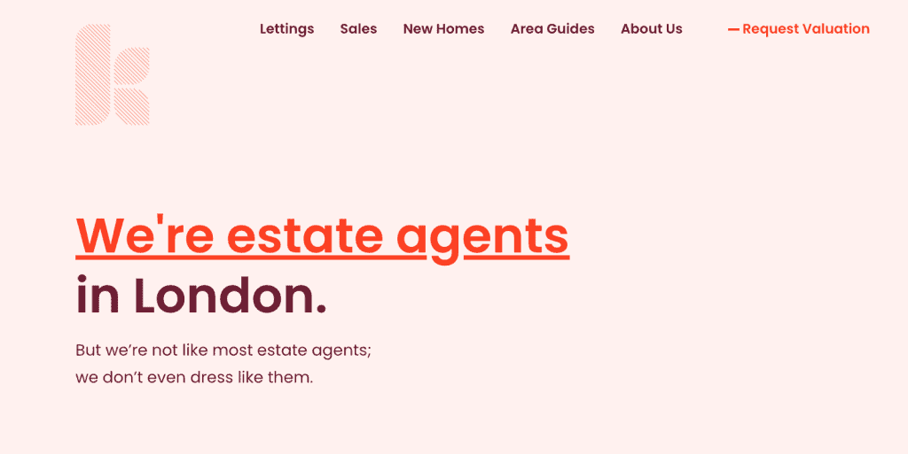
When conducting a UX audit, one of the first things to consider is whether you have a clear value proposition. In other words, let the user know straight away what your business does and what key benefits you can offer them.
When looking at a web page, people don’t want to think or work more than necessary. They want all the relevant information and elements to be clearly signposted and easy to find. Prospective customers want to understand what products or services you offer at a glance. This is not the place to be mysterious: let users know straight away who you are, what you do and why you stand out from the competition.
It’s a great idea to place your value proposition above the fold. This is the part of the page that is first visible when the user lands on the website. Don’t make the user scroll down to find it. By making users work too hard, you run the risk of them leaving before they get the chance to find out what your business is all about.

The job of the other imagery, designs and information on the page is to support the business proposition. Keep the tone and style consistent. If you want to project a fun, light-hearted image, your copy and images should be appropriate for that tone.
Think about it this way: if you were a brand new user visiting a website for the first time, what would make you believe the company can really offer what they claim to in their proposition?
Provoke a positive emotional response
Quality content matters, but users aren’t going to stick around to read it if your UI design isn’t working for them. Visual appeal and simple, clear website navigation will have the biggest influence on people’s first impression of your website and brand.
People have a positive emotional response to attractive visual design. They tend to believe that if a website looks better, it will work better. The aesthetic appeal of a website will heavily influence their decision to stay or leave. This positive effect is at its strongest when the website aesthetics support and enhance the website’s content and functionality.
But what exactly makes a website visually appealing?
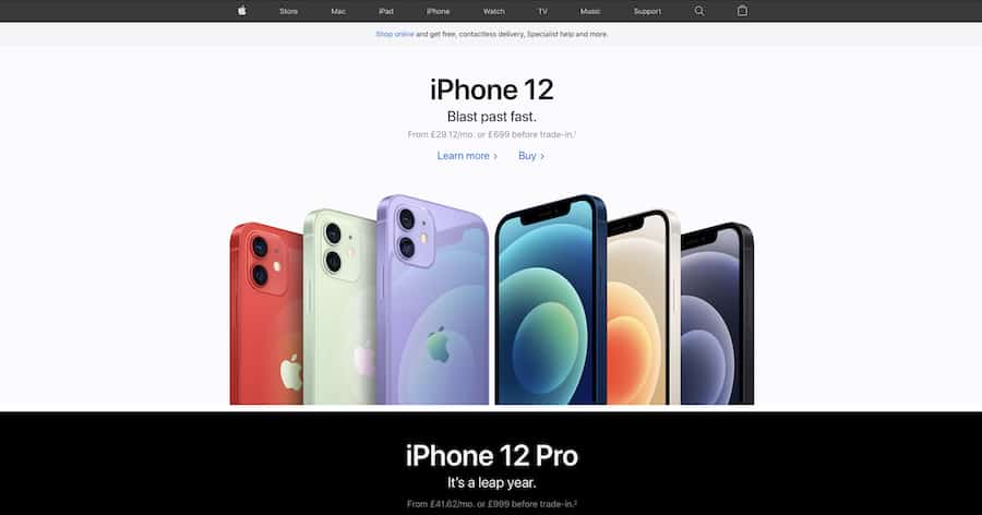
UX research studies at Google have shown that users prefer simple, clear websites with low visual complexity. It may be tempting to go all-out on your website or digital product with an imaginative and unique design, but this isn’t always the right choice. When it comes to user experience, following the expected conventions can be a better way to go.
White space between the elements will give them room to “breathe” and help users to focus on the important parts of the page.

Consider first impressions in your UX audit
If you want to be sure your website makes the best first impression on your users, heuristic evaluation can provide valuable insights. Conduct a UX audit with Heurix to identify potential usability issues. Heurix will help you to decide where to make improvements, and optimise towards achieving the results you want. Among the usability heuristics covered in the tool, we will help you to evaluate whether your website is making the best first impression on your users. This is one of the most important steps towards reaching your business goals.