When designing a website, it can be tempting to cram in lots of information, elements and visuals. After all, your business has lots to offer and you have lots to say. It may seem sensible to make sure your users can see everything together in one place. After all, the content might be useful for them at some point.
In reality, this approach can actually have the opposite effect to the one you want. You may end up driving users away before they’ve even had a chance to discover the purpose of the site. Generally, your best bet is to create a design with plenty of white space.
White space, or negative space, refers to the empty spaces in and around the elements and objects in your user interface. Despite the name, the space doesn’t necessarily have to be white. The term simply refers to the spaces between the UI elements, such as buttons, heading and navigation bars. White space may even be in the form of an image or a pattern.
White space is just as important a design element as pictures, graphics, fonts and all the other visual elements that go into a UI design. This is why it’s a quality you should consider when carrying out your website evaluation.
When used effectively, white space will:
- Improve readability. The spaces between words, letters, or lines of content on a page are examples of micro white space. With thoughtful use of micro white space, you can improve the readability of the content on a page. In turn this will improve the user experience.
- Provide focal points. White space can help users find the content or information they need, or draw their attention to a specific element. Looking at a cluttered interface is like looking at a cluttered room – it’s hard to find the item you’re looking for when it’s surrounded by many other items. Well-placed white space around the important elements guides the user’s eye. It makes it easier for them to reach their goals.
- Give users a positive emotional experience. Adding more “breathing room” around elements makes for a more relaxed, calming experience. It helps users to explore and navigate their way to the content they are interested in.
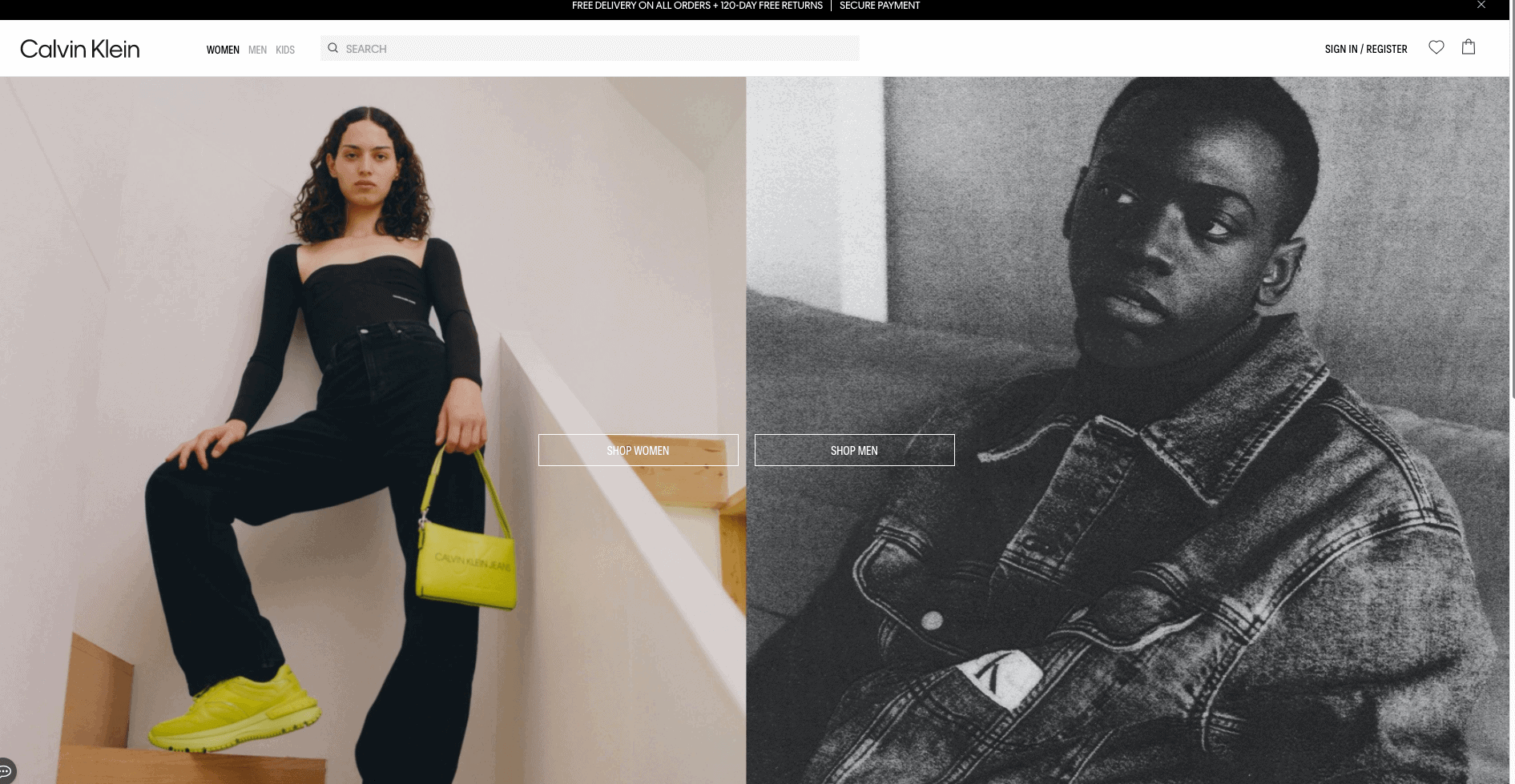
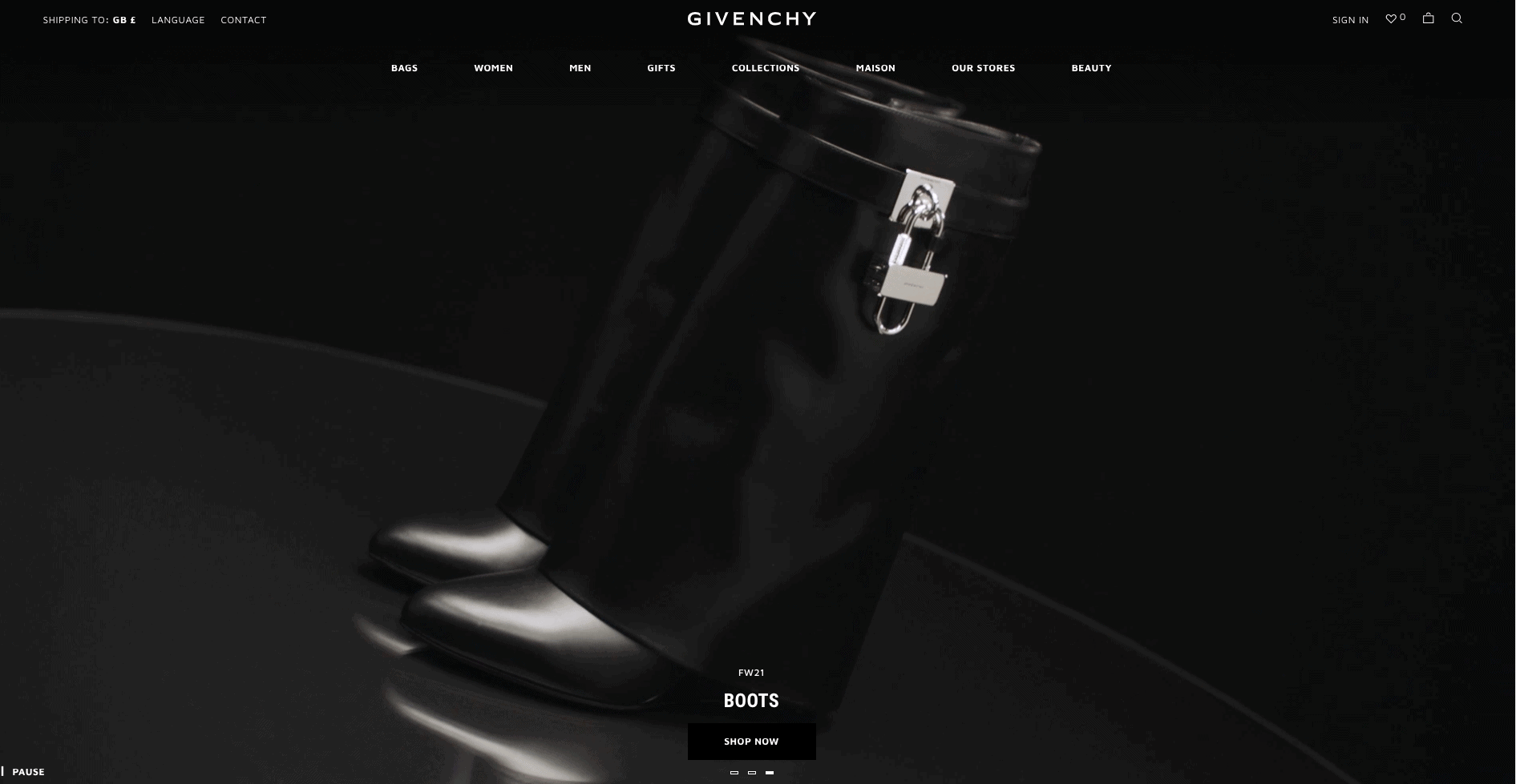
- Increase visual appeal. Users widely prefer simplicity and space, and tend to perceive these types of UI designs as more beautiful. Brand or product web pages often use white space to communicate a sense of elegance, drawing the user’s eye to the product.
“Aesthetic and minimalist design”
This is one of the guidelines listed in Nielsen’s heuristics, the most well-known and widely used website evaluation and usability heuristics. In this context, minimalist doesn’t necessarily refer to an interface that follows the minimalist design style; it simply means that an interface should only include elements which are necessary for the user to complete their goal.
It’s important to strike the right balance when evaluating for this heuristic. A cluttered interface won’t give the results you want, but a minimal interface which misses out necessary and useful elements or information will not provide a good user experience either.
The goal is to maximise usability and user experience with just enough elements.
Micro and Macro White Space
Macro space is the space between bigger elements, such as images, blocks of content, or text columns.
Micro white space is the space between smaller elements, such as letters (kerning), lines of text (leading), icons, or items on a navigation bar.
Both the micro and macro white space both have an impact on the overall aesthetic and functionality of a website.
The Gestalt principle of Proximity
White space is a useful tool for communicating relationships between different elements. Based on laws of visual perception, our brains build connections between different design elements when we look at web pages or any other kind of UI. The Gestalt principle of proximity states that elements which are placed closer together will be perceived as belonging together.
By grouping related elements close together and separating unrelated ones with more white space, you can distinguish different sections on your interface in a way that users will instinctively understand. However, if you group items too closely, the proximity of the items may become indistinct and the design will lose its meaning. Consistent spacing between related elements will help to maintain a cohesive design.
Uncluttered design and effective use of white space is an important heuristic to consider when creating any type of UI. This is one of the many heuristics that Heurix will guide you through during your UX audit. Start your website evaluation now with this easy, free tool and start considering how you could make more effective use of white space in your designs.